
Blog
Reality Check: Interview with featured artist Anna U Davis and Tim Brown, Hillyer Director
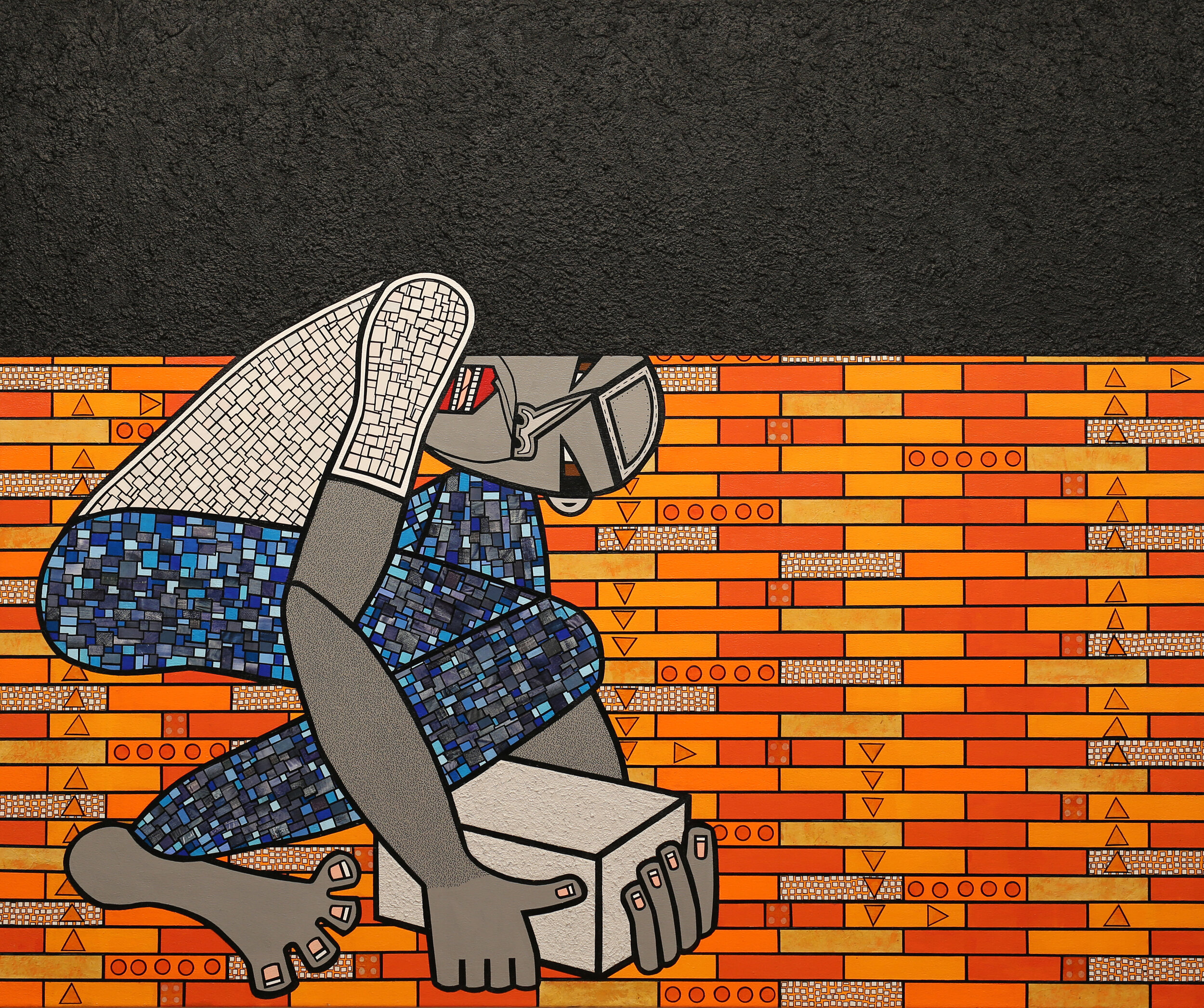
Anna U Davis, Our Weight, 2021, acrylic, ink pen, pumice and cut paper collage on canvas, 50 x 60 inches
Anna U Davis is a native of Lund, Sweden. Davis began expanding her artistic practice and developing her signature “Frocasian” characters after moving to Washington, D.C., in the 1990s. She is known for her bold, colorful mixed-media work, where she explores social inequalities. Davis is a two-time recipient of the Pollock-Krasner Foundation Grant and has recieved multiple fellowships from the D.C. Commission on the Arts and Humanities.
Reality Check is on view at the Hillyer from January 8 – February 27, 2022.
Tim:
Diffusion of Responsibility is a large-scale work that will inevitably capture the attention of our visitors. What is the meaning of this concept and what were you hoping to convey in this work?
Anna:
“Diffusion of responsibility” is a socio-psychological phenomenon where an individual, in a group setting, assumes that other people are responsible for taking necessary action. The concept was first brought to attention following the rape and murder of Kitty Genovese in 1964. The data gathered suggested that 38 people witnessed the attack but none of them attempted to help her or contacted the police. This concept has been studied for decades in psychology and applies to so many different areas, including my chosen topics of gender inequality, racial discrimination, and climate change. The truth is that we can all be guilty of diffusion of responsibility; one example is the fire in Pincourt, Canada, where several people witnessed and recorded the fire on their phones, but no one called the fire department and the building burned down. Or during a party, we hear a friend’s inappropriate racist joke about immigrants and we don’t say anything, we just stand there hoping that someone else will take responsibility and speak up. This work is an attempt to provoke the viewer to reflect on how to recognize and take accountability for your own inaction and become an active participant rather than a passive bystander. I intentionally created a larger piece constructed from multiple individual free-standing portraits. Each portrait represents any one of us and our own individual set of biases and life experiences.
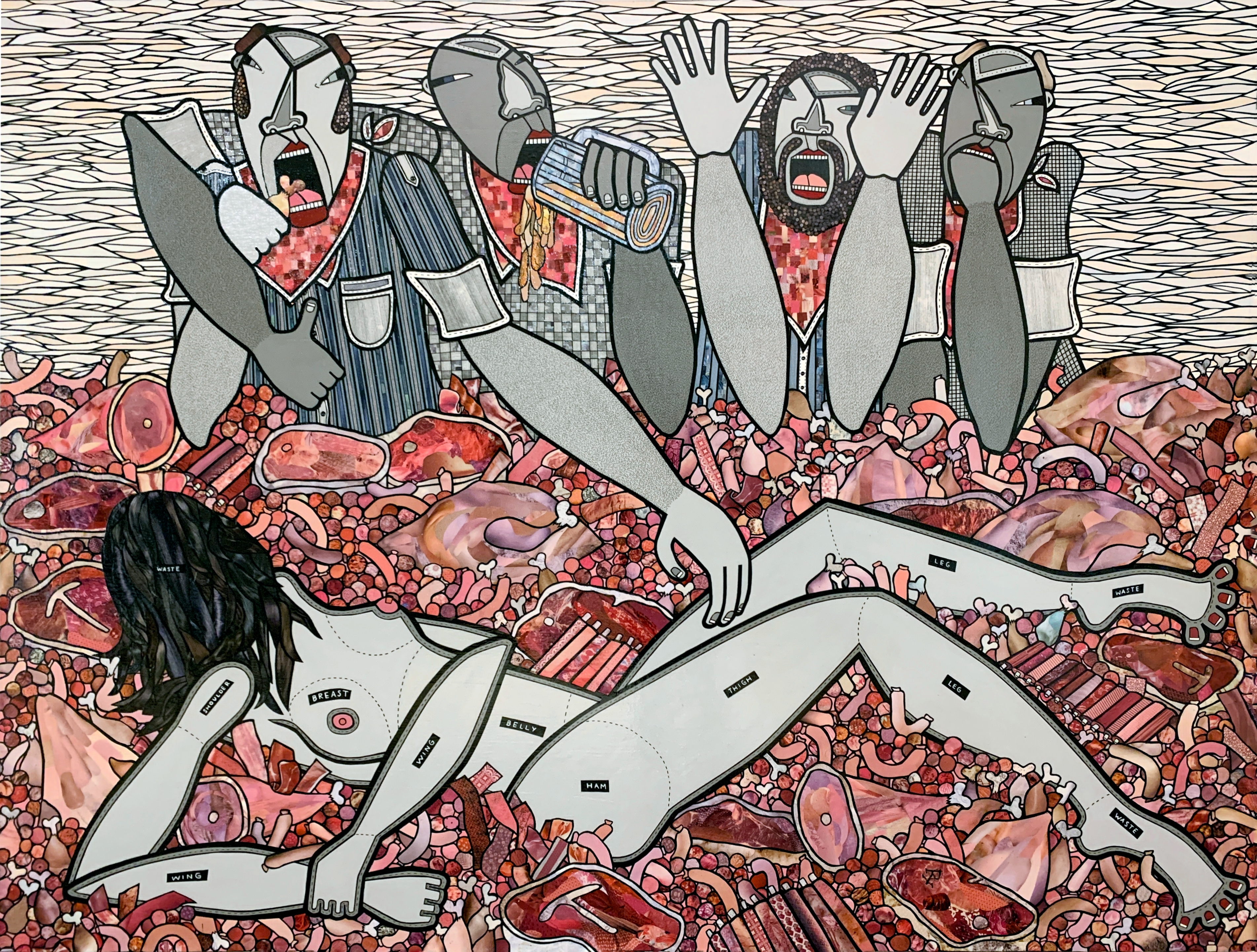
Anna U Davis. Shark-cuteri, 2016. acrylic, ink pen and cut paper collage on canvas. 72 x 96 inches.
Tim:
The gray tone in your figures appears to provide an alternative view of race and representation, a view that is different from predominant views of race and skin color, or what Frantz Fanon called the “epidermal schema.” Also, in color theory, gray is produced by mixing complementary colors together, colors that are opposite on the color wheel. What is the significance of the color gray? Does color theory play a role in your depictions?
Anna:
My signature gray Frocasian characters were born out of my interracial marriage. My husband, Peter, was born to a Swedish mother an an African American father in Lund, Sweden, and while we both grew up in the same town and went to the same school, our life experience has been different due to the color of our skin. My relationship with Peter and the birth of our son reinforced my desire to make a statement with my art. Up to that point, the figures in my art had been painted in various colors, ranging from primary to tertiary, but at that moment I decided they should be portrayed in grayscale. Gray is an achromatic color and the definition of gray is literally “a color without a color.” To me, that was the perfect color to represent my belief that we are all humans and we should all have equal rights, period. Unfortunately, society has a long way to go to become inclusive, equal, and to appreciate our diversity and recognize our joint humanity. And this is why I have spent decades creating work investigating social justice issues, focusing on gender relations, racial discrimination, health care, gun violence, and more recently, climate change.
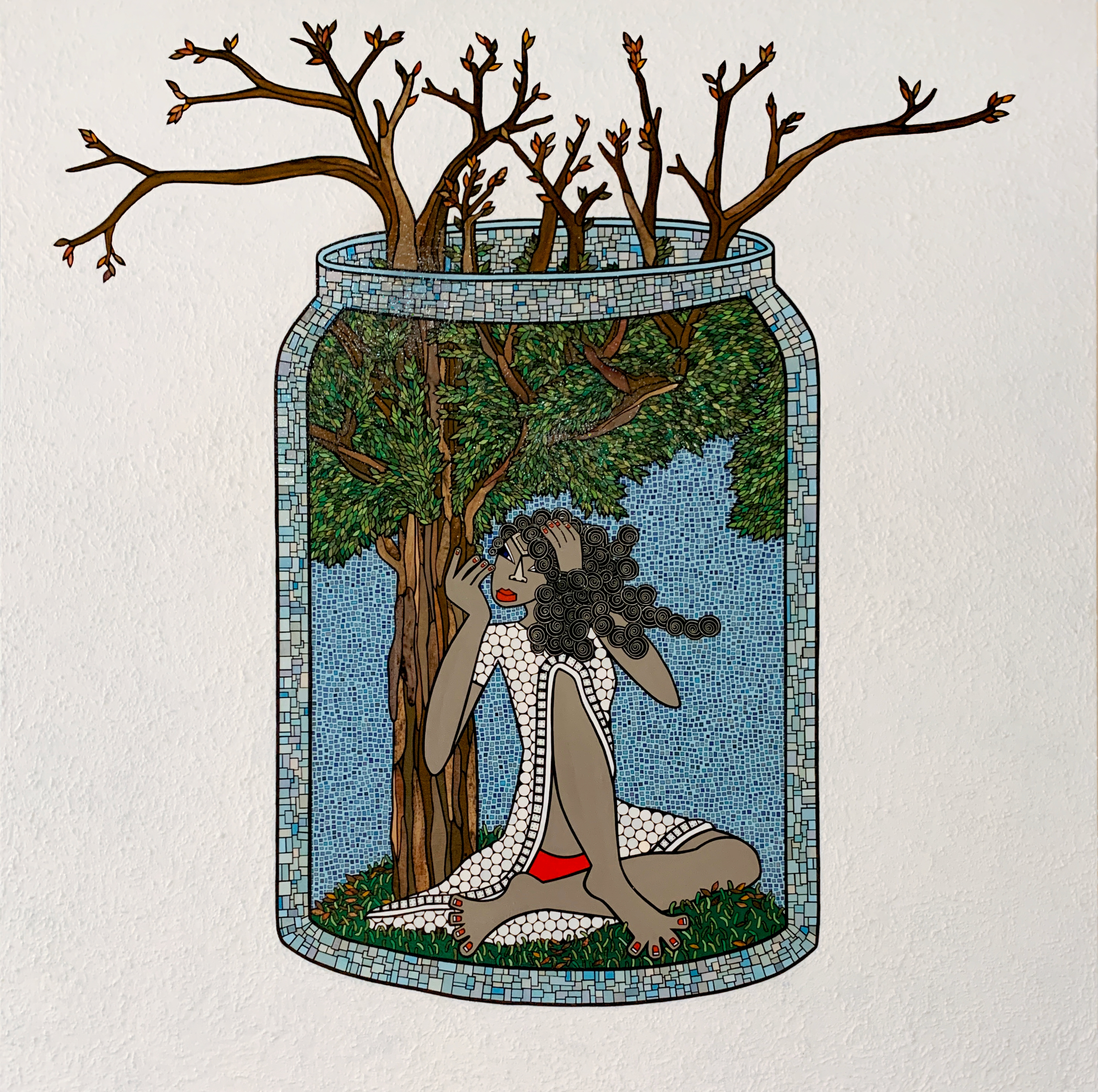
Anna U Davis, Biosphere, 2021, acrylic, ink pen, pumice and cut paper collage on canvas, 72 x 72 inches
Tim:
Your work represents three intersecting areas of social justice: gender inequality, racial discrimination, and climate change. What works in the exhibition would you say best represent these concepts?
Anna:
I would say Shark-cuteri, Our Weight, and Biosphere. Shark-cuteri explores the objectification of women and animals, comparing how we cut up animals into unrecognizable body parts with a woman who is equally cut up into sexualized body parts and put on display, ready for consumption. In advertising, you can see animals marketed with sexual innuendos referencing women’s body parts. When you objectify bodies, you view these bodies as things that serve you for a specific purpose. In this painting, both the animals and the woman have been reduced to objects for consumption. In Our Weight, I explore racial discrimination and the consequences of a discriminatory system. The weight symbolizes the inequality that persists, whether it is in regards to access to education, to jobs, to healthcare, or so many other areas. The cinderblock is a reminder of the effort it takes to create change, particularly in a world where most people are reluctant to take an active role in social justice issues. The piece Biosphere reflects on the possible consequences and outcome of our continued mistreatment of our planet. Since the onset of the Covid-19 pandemic, I have not been able to see my family in Sweden. For the first year we isolated, due to being immunocompromised, and did not really go out until we were all fully vaccinated. These circumstances made me much more aware and immersed in my immediate surroundings. As a family we started to order most of our supplies online, and it was overwhelming to see the amount of trash, mainly packaging materials, we had to try to recycle every week. I started to think back to the time I visited my sister in Sweden and the time I was helping her to take out the trash to the recycling station in her apartment building. Note that in Sweden you recycle almost everything. The plastic, the metal, the paper, the newspapers, the magazines, the batteries, and so on go into separate boxes, and the glass has to be sorted into colored or clear glass. In Washington, DC, I have one smaller bin where everything that should be recycled goes into, and I often wonder how effective this single-stream recycling system really is.
Tim:
Art lovers and students of art will be drawn to your expressive figures, lush colors, and bold use of line. What role did your formative development play in defining your pictorial language? Have other artists influenced your work?
Anna:
Art serves a dual purpose for me. It is a vehicle to express my socio-political views and a coping mechanism. As a young child, I would create pictures to deal with my emotions, and as an adult, in particular after my 2013 breast cancer diagnosis, my art practice has helped me to handle a traumatic experience, and continues to help me on a daily basis to deal with chronic pain due to radiation myelopathy. As a child I was drawn to visual experiences, like the old black and white movies. I loved watching the characters’ body language and facial expressions while exploring the narrative. I remember the time I was riding the subway in London and I noticed a woman reading a book. She was so immersed in her activity and exuded such a powerful energy that it inspired me to get off the train and go out and buy the book she was reading. I believe some of the best work I have created was inspired by visual experiences. Maybe that is also why I, early in my artistic practice, decided to break down the human form into basic geometric shapes and lean on expressing my characters’ emotions through abstracted exaggerated placements of their facial features and body parts. I am drawn to the intense colors found in nature- the gray blue sky just before a thunderstorm, the yellow field of flowering rapeseeds, or the intense red of a poppy flower in the midst of a bright green summer field. I use color as a way to enhance and evoke emotion as well as to balance composition. My first artist love was the fearless Frida Kahlo and her unapologetic storytelling and how she challenged social norms. I fell in love with the bold black outlines of Keith Haring’s work, the striking collages of Romare Bearden, and the organic structures Antoni Gaudí. These are some of the artists who have played a part in my artistic development and who all continue to inspire me to this day.
To learn more about Anna U Davis, visit her website.